3M REDESIGN
BRAND IDENTITYInstructor: Peter Ahlberg
3M graphic identity hasn’t been redesigned for more than 20 years. It has been in the same design in people’s eyes for a very long time.
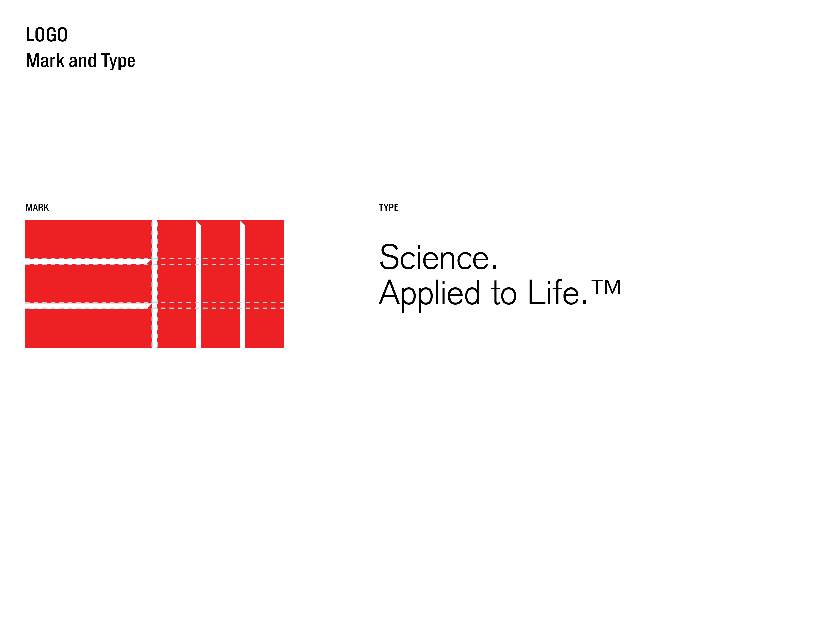
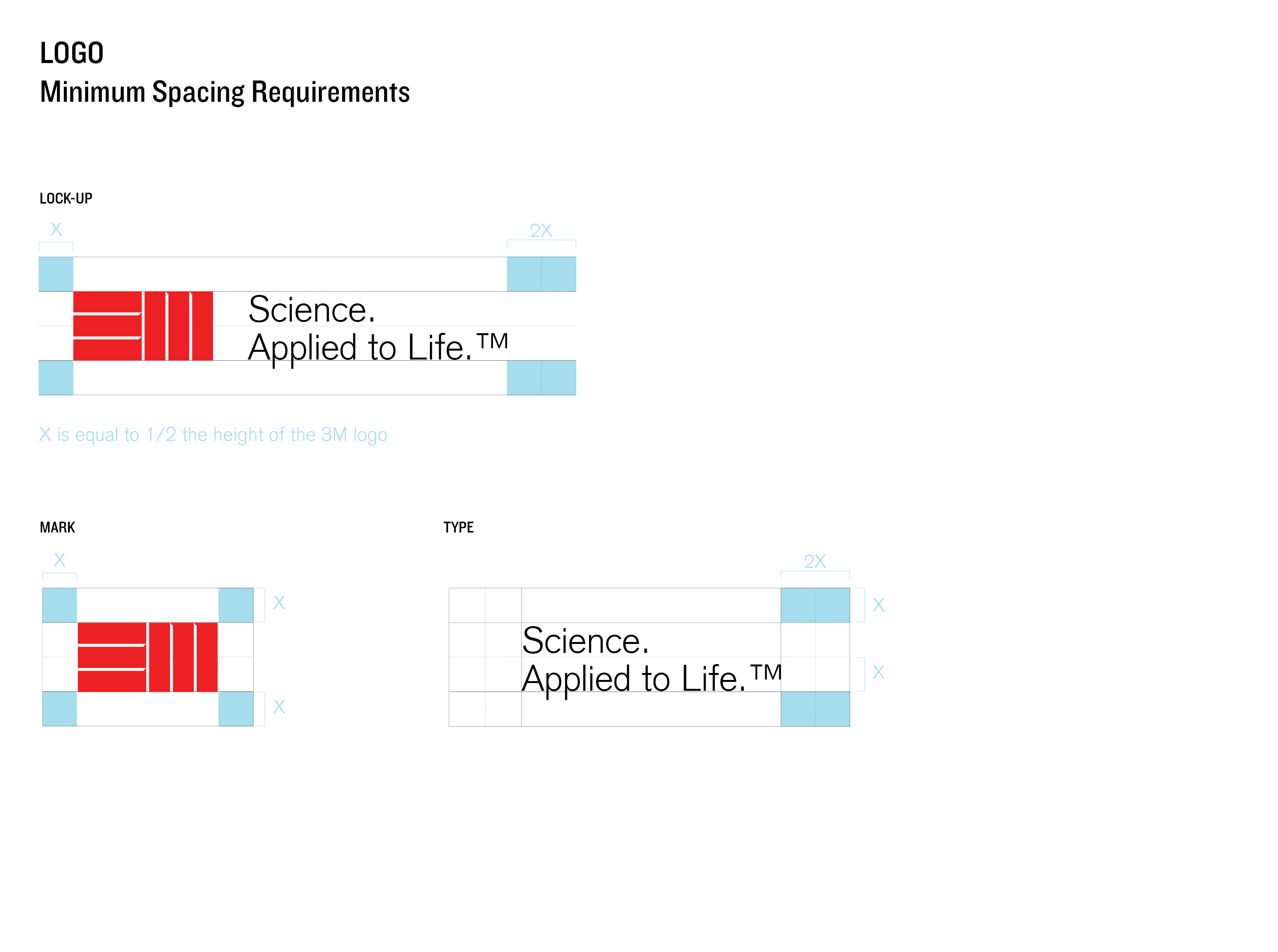
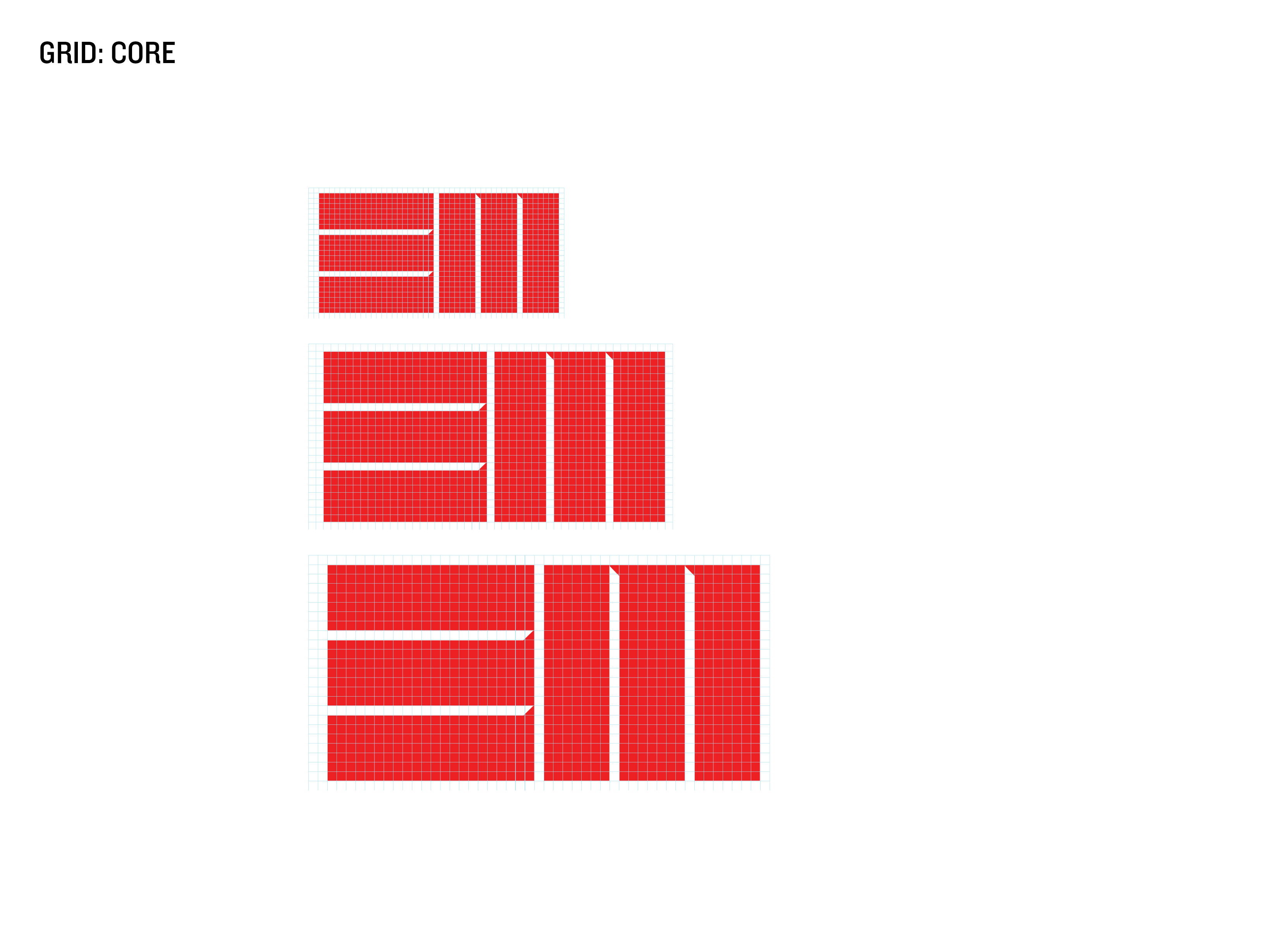
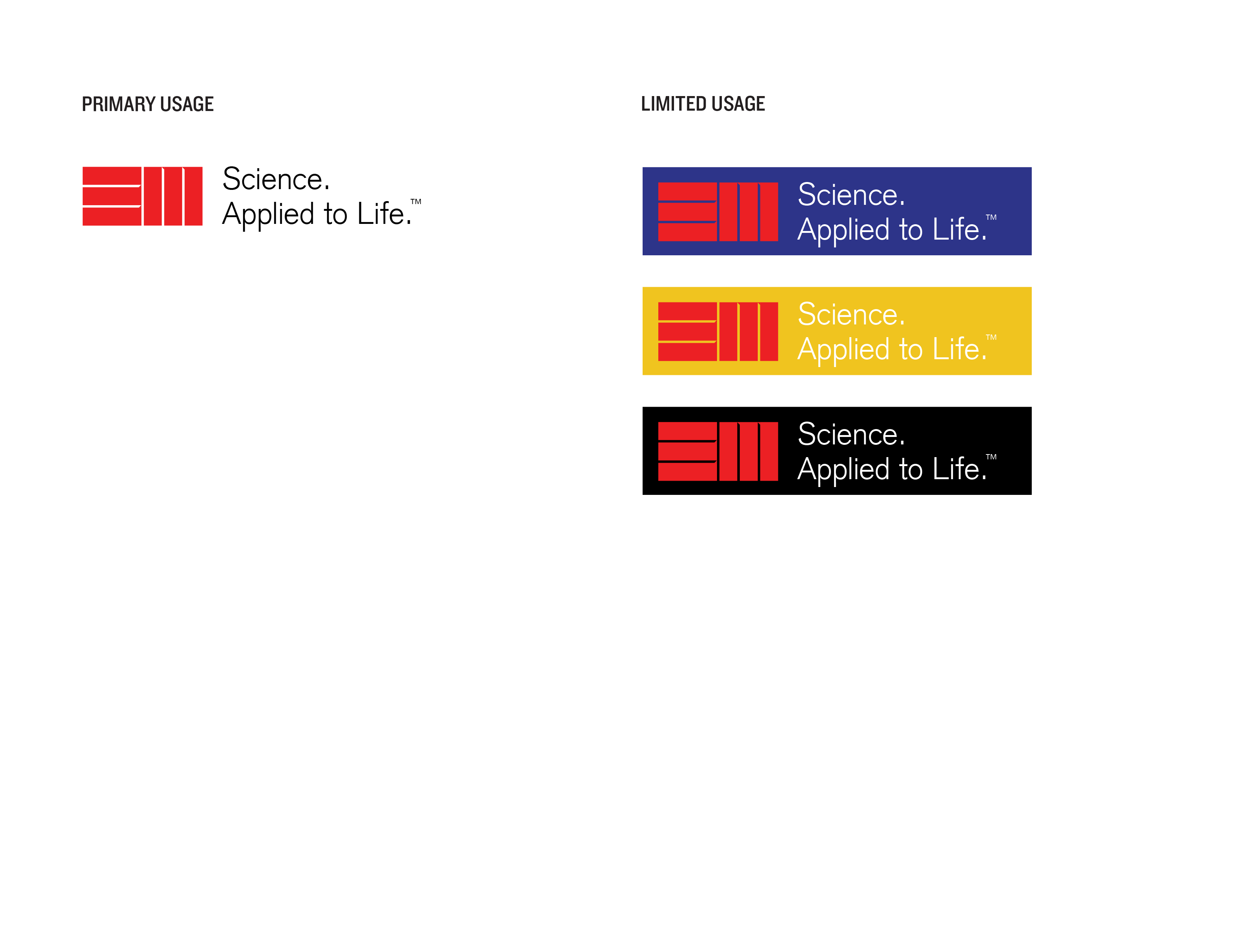
The main idea of the logotype is not changing the whole concept of having a very strong, intense, and authoritative piece of design. By putting some edge to the spaces and playing around by having perfect spacing added the essence to this logo. The edges and spaces show the 3M identity of having the world the unique, multidimensional ways can touch in people’s lives.
The main idea of the logotype is not changing the whole concept of having a very strong, intense, and authoritative piece of design. By putting some edge to the spaces and playing around by having perfect spacing added the essence to this logo. The edges and spaces show the 3M identity of having the world the unique, multidimensional ways can touch in people’s lives.
