Client, Year
NBC Universal-Comcast, 2023
Role
Product Designer Summer Intern
Duration
10 Weeks
Skills
UX Design, Visual Design
Tools
Figma, Microsoft Excel
NBC Universal-Comcast, 2023
Role
Product Designer Summer Intern
Duration
10 Weeks
Skills
UX Design, Visual Design
Tools
Figma, Microsoft Excel
Description
My collaboration extended to working closely with product management, user research, and engineering teams, where we held weekly design workshops to foster a spirit of teamwork and shared insights with stakeholders.
At the time of my involvement, Peacock was in the midst of a transformation, and I contributed by offering a new perspective. My primary objective was to comprehensively understand the product design journey from inception to completion, with the ultimate aim of improving user engagement and usage by simplifying the user experience.
single-page view ︎︎︎
How might we design a product that simultaneously meets
business goals + fulfills user needs?
01. Research + Strategy
Account design for the peacock has yet to be updated or refreshed since launch. To make it more flexible for the increasing number of propositions trying to fit into it, finding the best design now will help set us up for those additional updates planned in the future.

OBJECTIVE
The Peacock Commerce team would like to redesign to help support KPIs. However, the team wants to gain more insight into the best way to achieve this from user testing.
- What do users expect to see when managing their account and where they would expect to find these things?
- What are users looking to do when they come to account? What layout most appeals to them?
- How can we get users to find and complete their task faster so they can get back to watching?
HYPOTHESIS
Previous research told us that users want to "get in and get out" and expect fairly minimal time investment in making updates in the Account. It also has shown us that peacock users expect 5 account categories
- Account, plans, and payment
- Devices
- Security
- Video settings
- Users or profiles
RESEARCH PLAN
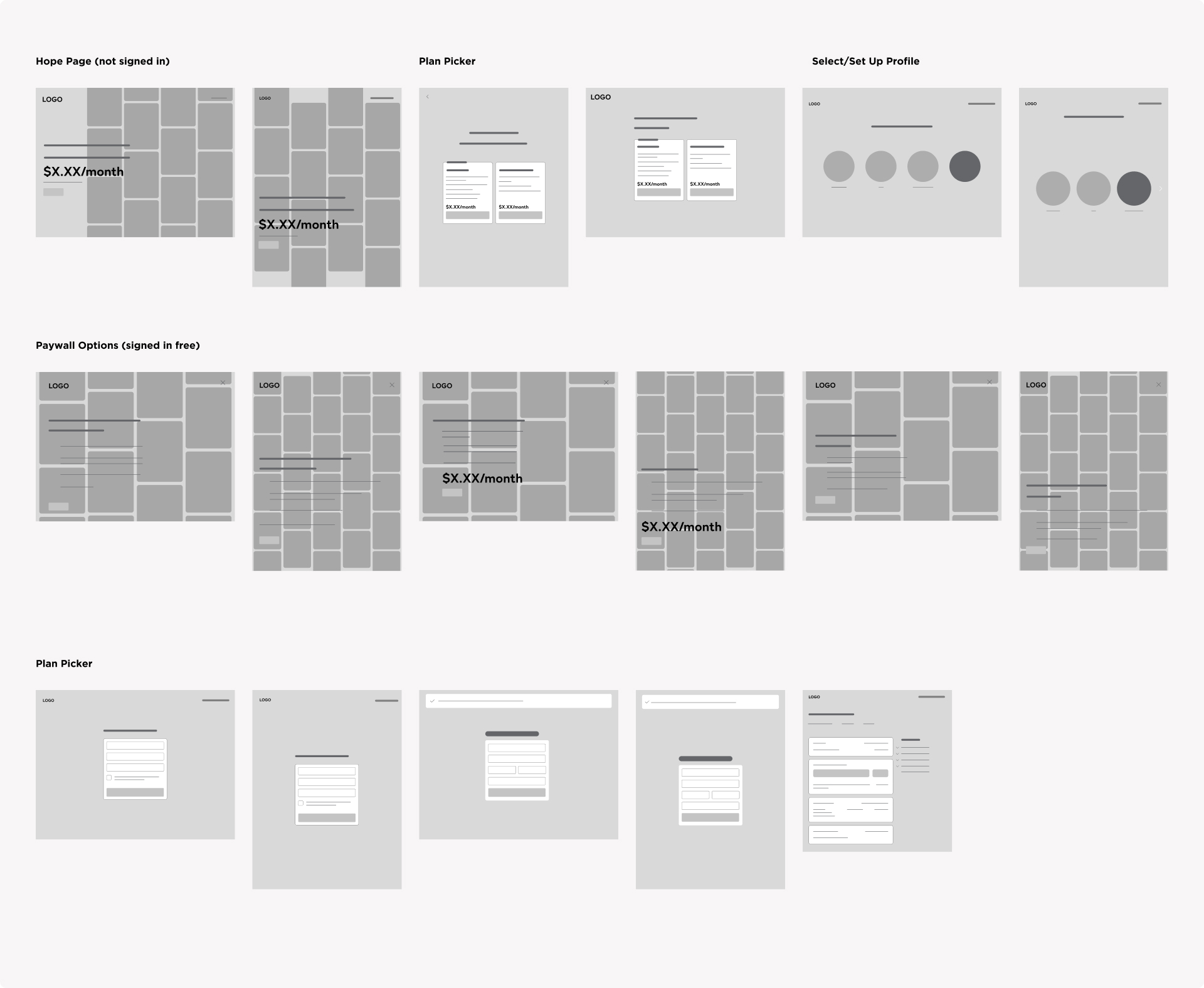
User testing Screens
- Current design
- Single page design
- Design with additional tabs similar to what was laid out in the previous research
- Same tabs but elements laid out in a different way (pull up personal details to first tab, rename tab names, etc)
- Preference would be to provide users with a list of tasks to see how long it takes to find/complete that task
ACCOUNT FINDINGS
It showed users appreciated a single-page layout. The information architecture of our account and settings areas are not clear to people. People do not understand where to manage their accounts, update their settings, or change their profile information.
- Collaborated with the central Consumer Insights team to conduct user research.
- Identified opportunities for innovation, with a focus on user and business value.
- Followed the Human-Centered Design (HCD) process within the Peacock TV Commerce team, with an emphasis on the Account screen.
- Discovered 1-2 feature parity elements, recognized patterns, and defined competitor architecture.
- Participated in shadowing account meetings and observed historical research processes.
USER - TESTING SCREENS

GOALS
We need to rethink the information architecture to ensure proper categorization, minimize fragmentation, and simplify the user experience while also considering future-proofing strategies such as accommodating complexity, potential joint ventures, and adapting to evolving legal requirements.
CHALLENGES
We've identified potential failure points and obstacles that could impede our progress towards achieving our objectives through card sorting exercise.
DATA
We've gleaned valuable insights from user feedback, while simultaneously facing a range of challenges Image
We need to rethink the information architecture to ensure proper categorization, minimize fragmentation, and simplify the user experience while also considering future-proofing strategies such as accommodating complexity, potential joint ventures, and adapting to evolving legal requirements.
CHALLENGES
We've identified potential failure points and obstacles that could impede our progress towards achieving our objectives through card sorting exercise.
- Identified challenges: Expiring deals, tech limitations, changes in plans, legal issues, and future payment changes.
- User experience focus: Aligning design for a seamless app experience and addressing abandoned carts.
- Backend management: Managing various user states and ensuring no disruption to current functionality.
- Account settings clarity: Distinguishing between profile and account settings, listing essential components needed in the account.
DATA
We've gleaned valuable insights from user feedback, while simultaneously facing a range of challenges Image
- Differentiating plan upgrades: Plans presented separately, though treated as add-ons in accounts; suggested to use the same call-to-action (CTA) for clarity.
- Terminology: Participants familiar with "affiliates" terminology; recommended clarifying terms.
- User confusion: Participants were unsure about Peacock Plus and pricing constraints.
- Decision-making complexity: Users faced challenges in distinguishing between upgrading plans and adding extras, and with the number of decisions on one page.
KEY FINDINGS
Users primarily access their accounts to address specific issues, such as updating payment methods, value the simplicity of login and account usage, express apprehension about altering settings, especially concerning advanced security options or undoing changes, and expect account categories including Account, Plans and Payment, Devices, Security, and Video Settings, as well as Users/Profiles.
Users primarily access their accounts to address specific issues, such as updating payment methods, value the simplicity of login and account usage, express apprehension about altering settings, especially concerning advanced security options or undoing changes, and expect account categories including Account, Plans and Payment, Devices, Security, and Video Settings, as well as Users/Profiles.
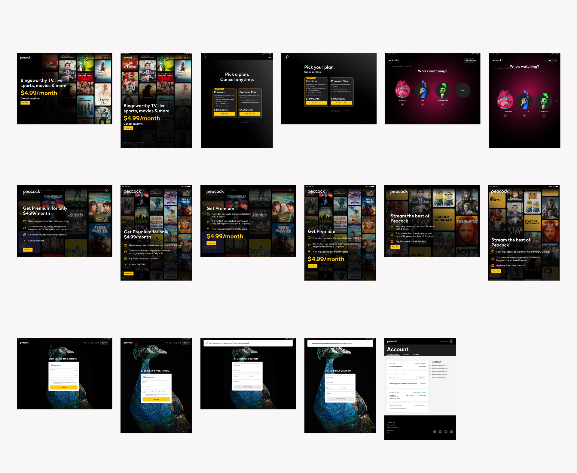
Netflix & Hulu
Appreciated single-page layouts: making it obvious what settings were available
Appreciated single-page layouts: making it obvious what settings were available
Spotify & Amazon
Mixed review; some users appreciated the transparency; others found it confusing and disjointed
Mixed review; some users appreciated the transparency; others found it confusing and disjointed
Peacock
Desire settings were easily found and pages were scannable
Desire settings were easily found and pages were scannable
- Pain points: revisiting around upgrades & settings
- Suggestions: card sort exercise rereleased a desire for more categories ( 5 instead of 4) to help users more easily locate setting
“
I don't really like to mess with it (settings) too much. It's normally just the age stuff and then just setting up profiles for the kids."I’ll use the account to make sure that the appropriate devices are being used and no one has our password.”
Making sure that no one has access to things that are important, like my email, my credit cards and things that I’m using.”
“
If we were to randomly go out and get Peacock, for instance, I’d assume it would take me four minutes to get the whole thing situated and have my account set up.”I have done that in quite a while actually so it's a good idea to change mypassword."
I don't want to click on settings / don't know."
REFINING USER EXPERIENCE OPPORTUNITIES
Based on the card sorting activity conducted with the research and design team, below is the grouped summary.
Refining Product Offering: How might we revise and refine the product offering shown in "Your Plan" and "Change Plan" cards? Differentiate optional features from required to make plans and add-ons clearer. Provide room for updates for additional add-ons.
Notification Enhancement: How might we create a more obvious but friendly way to notify users of plan changes from Free to Premium? Consider implementing a notification system for subscription changes. Allow users to pause and restart subscriptions conveniently.
Improving User Navigation: Provide shortcuts to account from various viewing points. Incorporate iconography and quick links for faster navigation. Include room for offers and watch history management for enhanced user experience.
Reframe challenges as opportunities starting from HOW MIGHT WE?“
Based on the card sorting activity conducted with the research and design team, below is the grouped summary.
Refining Product Offering: How might we revise and refine the product offering shown in "Your Plan" and "Change Plan" cards? Differentiate optional features from required to make plans and add-ons clearer. Provide room for updates for additional add-ons.
Notification Enhancement: How might we create a more obvious but friendly way to notify users of plan changes from Free to Premium? Consider implementing a notification system for subscription changes. Allow users to pause and restart subscriptions conveniently.
Improving User Navigation: Provide shortcuts to account from various viewing points. Incorporate iconography and quick links for faster navigation. Include room for offers and watch history management for enhanced user experience.
02. UX + Design System
Led the Peacock's repository consisting of competitor screens and flows for both web and mobile platforms.
DESIGN SYSTEM![]()


Detail Screens for “Account page”


03. Future Works
After several weeks of work, I assisted other teams in preparing for the upcoming 2024 Peacock update by contributing to the creation of Peacock's repository. This repository includes competitor screens and flows for both web and mobile interfaces, as well as wireframes and other related materials.
- Commerce Template Update
- Creating consistency across product, brands, platforms, & teams reducing swirl over design and conflicting specs
- Increasing design team velocity and reduces redundancy by providing a toolbox of reusable styles, components & templates
- Improves design team handoff to developers, working closely with them to ensure Figma & Code components match
- See how one design system can cover multiple platform
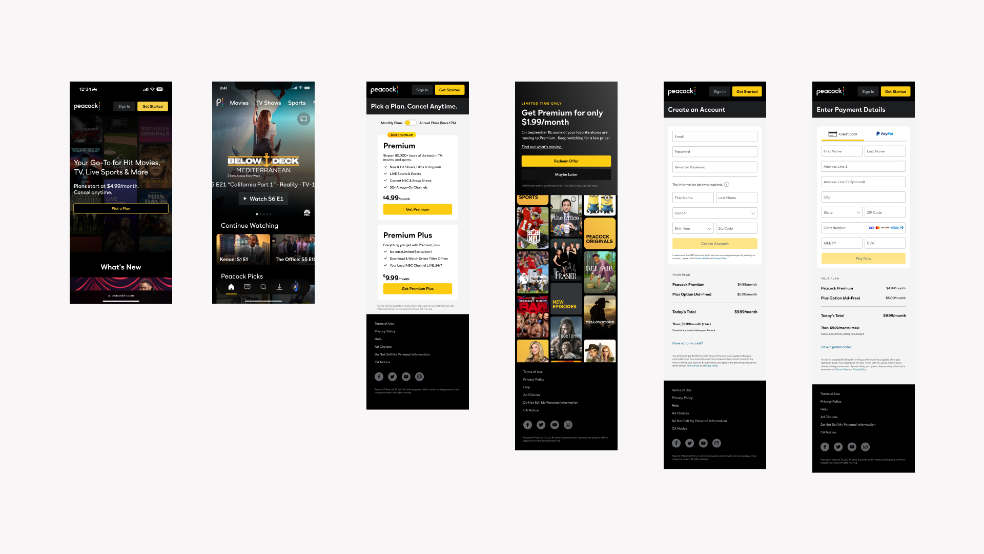
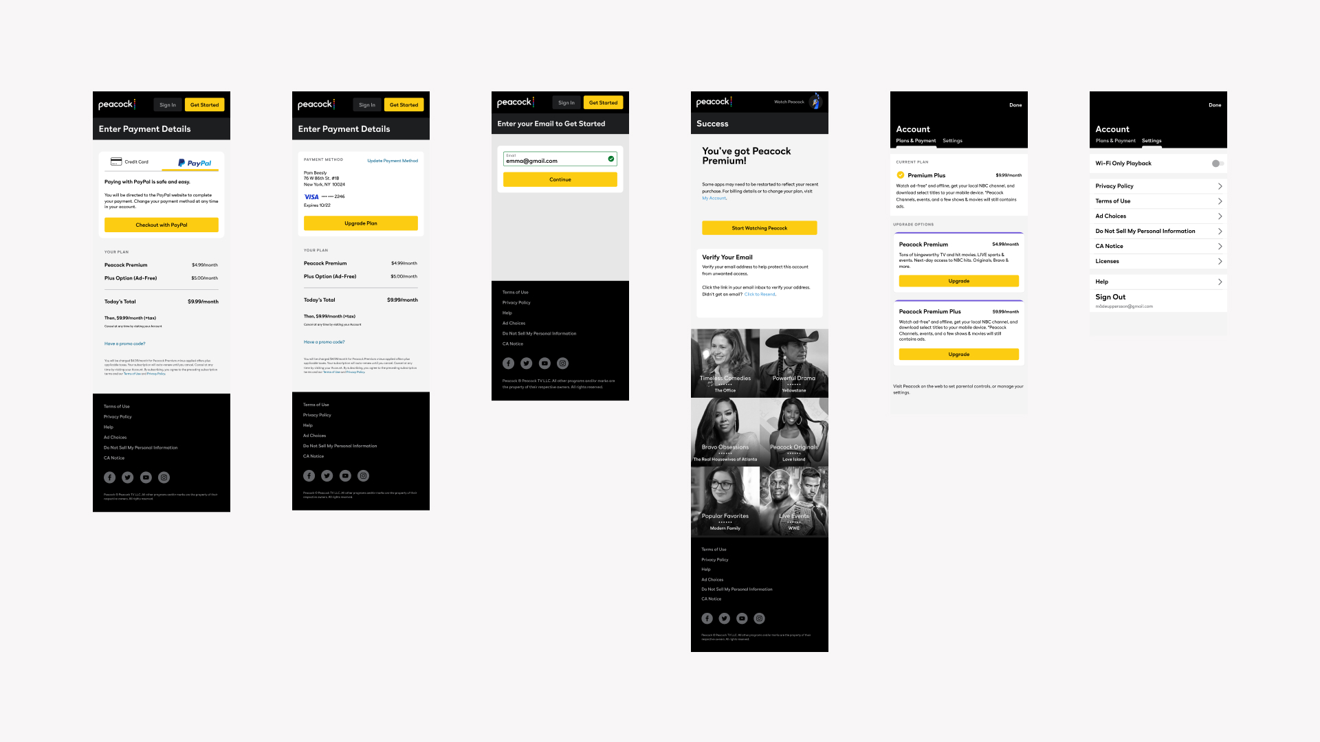
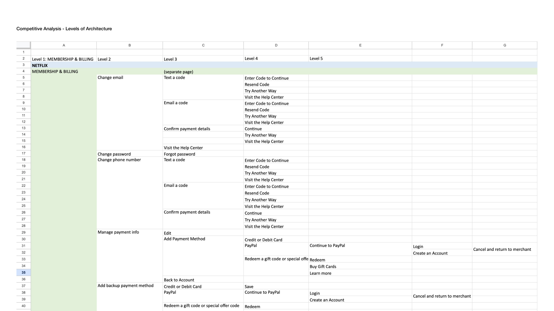
COMPETITIVE ANALYSIS


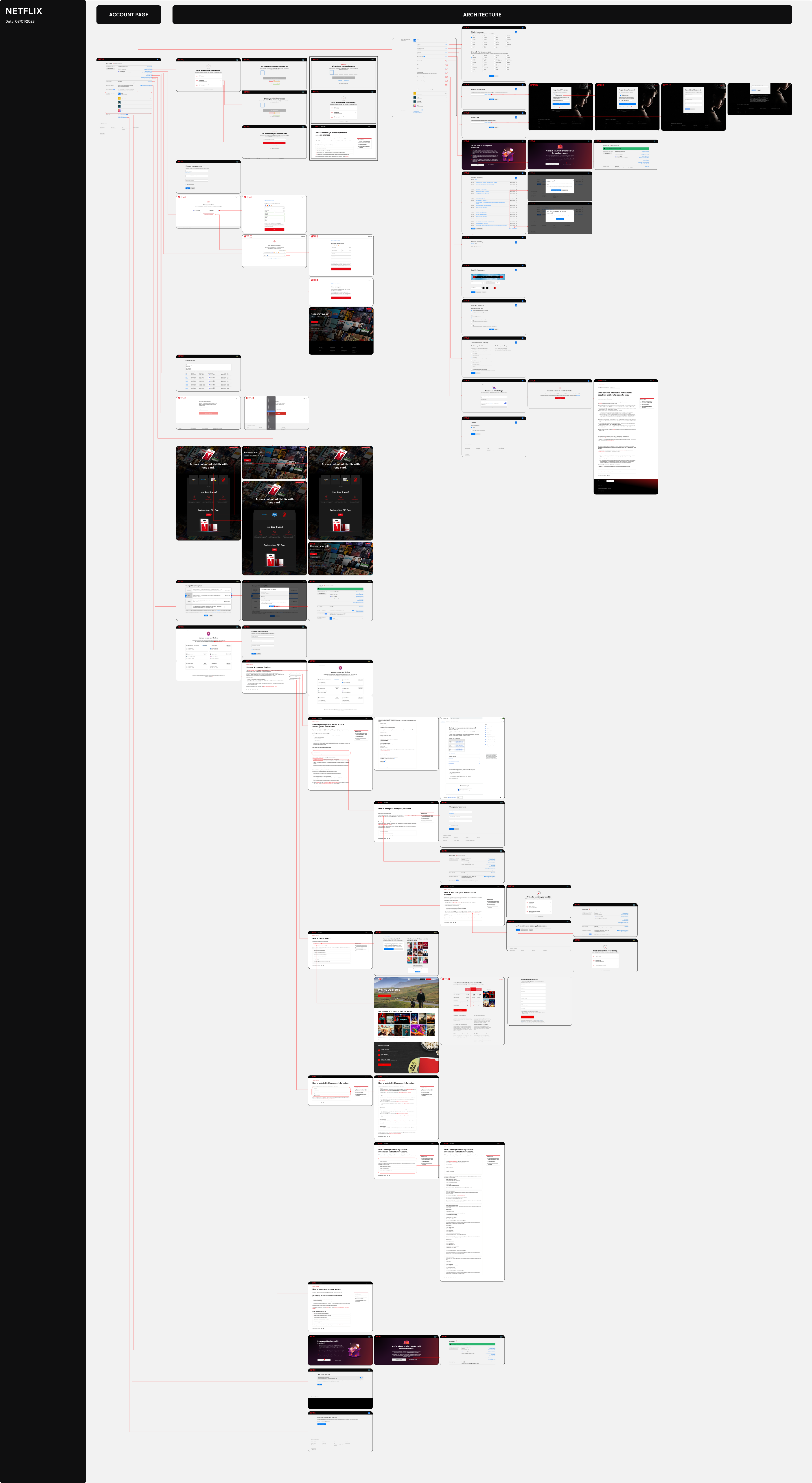


UX ARCHITECTURE
- Help define product roadmap & requirements by creating upfront strategy tools(e.g task & content analysis)
- Translates a requirements into low-fidelity flows, scenarios to show inventory & information required for users to step through their journey
- Enables early collaboration and conversation with developers and other key stakeholders to explore feasibility without spending time on high-fidelity work
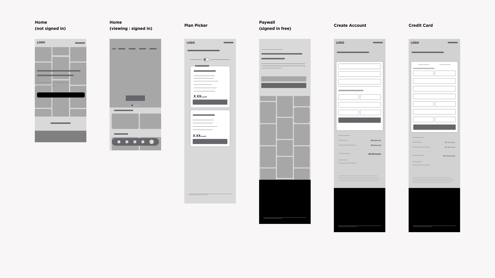
1. Web- Mobile
![]()
![]()
![]()
![]()
2. Connected-Tablet
![]()
![]()
3. Architecture Evaluation
![]()
![]()
![]()
![]()

2. Connected-Tablet
3. Architecture Evaluation

INFORMATION ARCHITECTURE
![]()

04. Lesson Learned
- Gained valuable insights into the inner workings of streaming services
- Came to appreciate the significance of UX thinking and Human-Centered Design Methods (HCD)
- A well defined design system not only enhances efficiency but also saves valuable time for the entire team
- Observing the dynamics of price fluctuations and witnessing the intricate coordination of tasks during significant events provided me with a valuable and enlightening learning experience. I am truly grateful for the opportunity

